Theme Druxt components
Customize Druxt component output with wrapper components, the default template, slots and props, without forking or patching the framework.
Before you start: this guide assumes a working Druxt site (see Getting started). It also helps to have read Component resolution for why the suggestion chain works the way it does.
Druxt components can be themed using two primary methods:
DruxtWrapper
Druxt modules use a DruxtWrapper component system to render a Vue component with the available data, slots, props and $attrs to be used for theming.
The specific component rendered is determined by list of available component options, made from properties and data provided by the module, and using the first registered option.
e.g., A DruxtEntity component might render a DruxtEntityNodeArticleDefault.vue wrapper component.
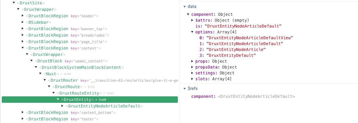
Component options can be seen via the component.options data of the relevant Druxt module component.
If there are no matching component names, a default DruxtWrapper component will be used to render the default output of the module.
- For more details, see the DruxtModule API documentation.
<Druxt module="entity" :props-data="{ type: 'node--article', uuid }" />
<!-- ~/components/druxt/entity/node/article/Default.vue -->
<template>
  <div>
    <h1>{{ $attrs.entity.attributes.title }}</h1>

    <slot />
  </div>
</template>
Default template
Most Druxt modules can have the default template overridden, allowing for full control of the default slot rendering.
The available data provided to the template scope is determined by the relevant module.
<DruxtEntity v-bind="props">
  <template #default="{ entity }">
    <div>
      <h1>{{ entity.attributes.title }}</h1>
    </div>
  </template>
</DruxtEntity>
By default, a component using the default template will not be wrapped by a DruxtWrapper component. It is possible to enable the DruxtWrapper system by setting the wrapper property to true:
<DruxtBlock v-bind="props" :wrapper="true">
  <template #default="{ block }">
    // This will be wrapped by a DruxtBlock Wrapper component.
  </template>
</DruxtBlock>
"Missing Vue template" box
Two components, DruxtBlock and DruxtField, opt into a dev-mode debug box
when nothing themes them yet. For a block you'll see:
Missing Vue template for the 'umami_search' block
For a field, the wording differs slightly (Missing Vue template for '<schema.id> (<schema.type>)'), since each component authors its own
fallback rather than inheriting one from DruxtModule. Other modules don't
currently have this box at all; a missing wrapper there just renders the
plain DruxtWrapper default output described above, with nothing to expand.
Either way, this is expected, not an error, and it only renders when Nuxt
is in development mode ($nuxt.context.isDev); production builds show
nothing there instead. Expand it and you'll find a dropdown of every valid
wrapper name for that component (from component.options, the same list
described under DruxtWrapper above) plus a Create
button that scaffolds the file for you, wrapper path already filled in.